Overview:
This project is a responsive and mobile-friendly static website designed as a portfolio for a Small Medium Enterprise (SME) company specializing in e-commerce, printing, and advertising services. It is tailored to showcase the company’s offerings, projects, and professional expertise while ensuring accessibility across all devices.
Technologies Used:
- HTML: For creating the website’s structure with semantic and accessible markup.
- CSS: For styling the site and delivering a visually cohesive design.
- Bootstrap 5: For building a responsive layout that adapts seamlessly to desktops, tablets, and mobile devices.
- JavaScript: For adding interactivity and enhancing the user experience.
Key Features:
-
Home Page:
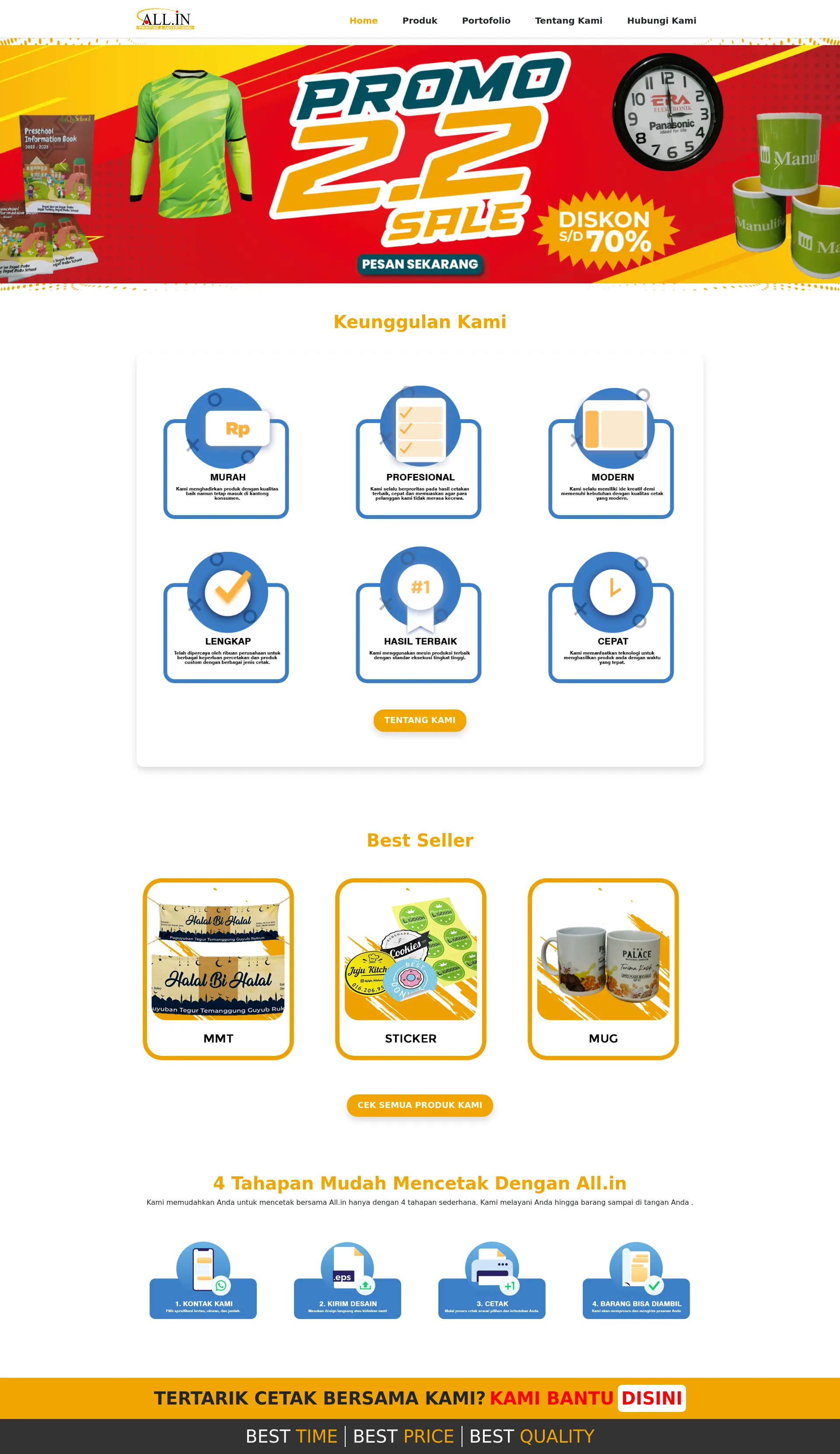
- A welcoming and dynamic landing page optimized for both desktop and mobile users.
- Highlights the company’s core services and value propositions with an attractive and fluid design.
-
Product Page:
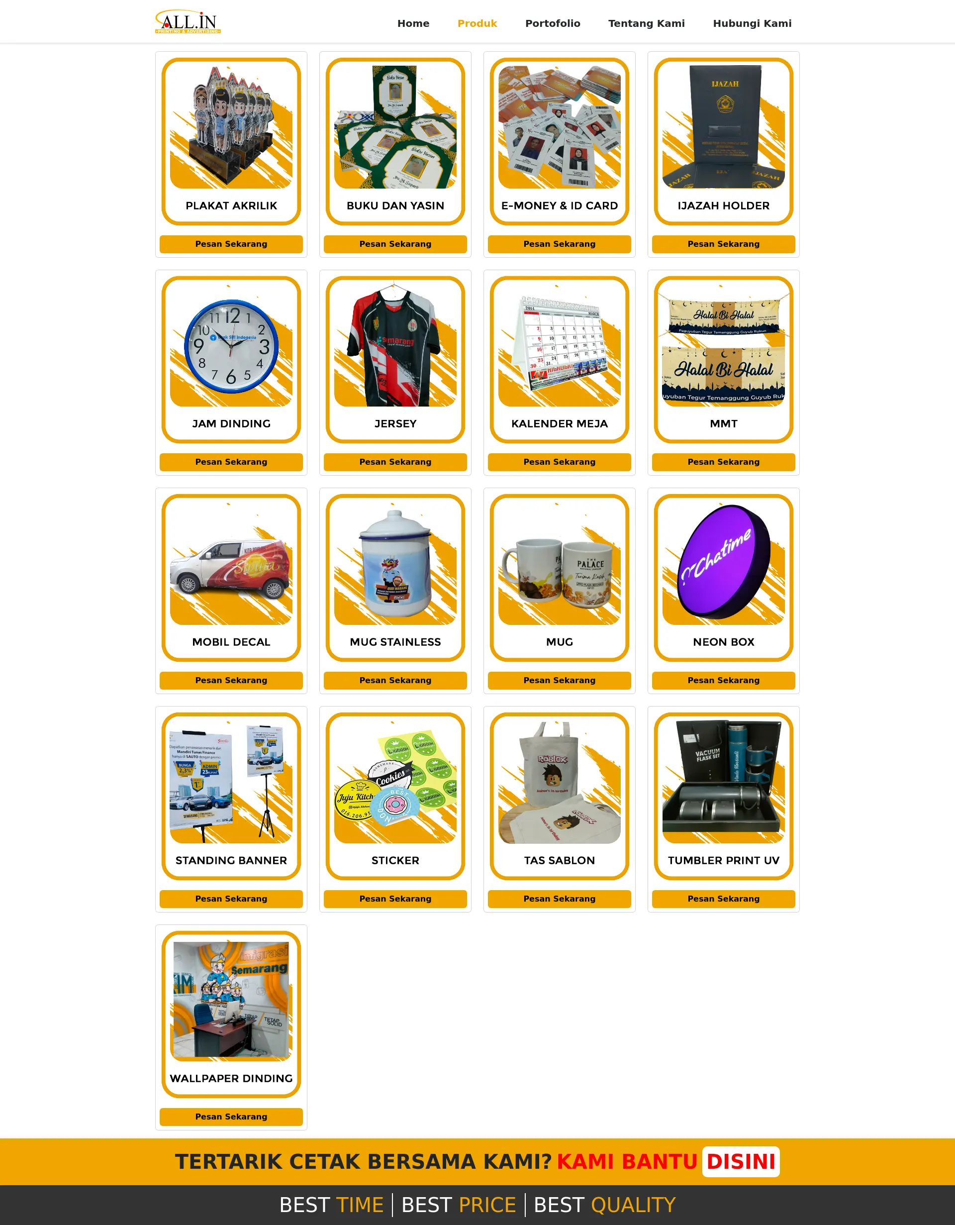
- Displays a visually appealing catalog of products with descriptions and images.
- Fully responsive grid layout to ensure optimal viewing on various screen sizes.
-
Portfolio Page:
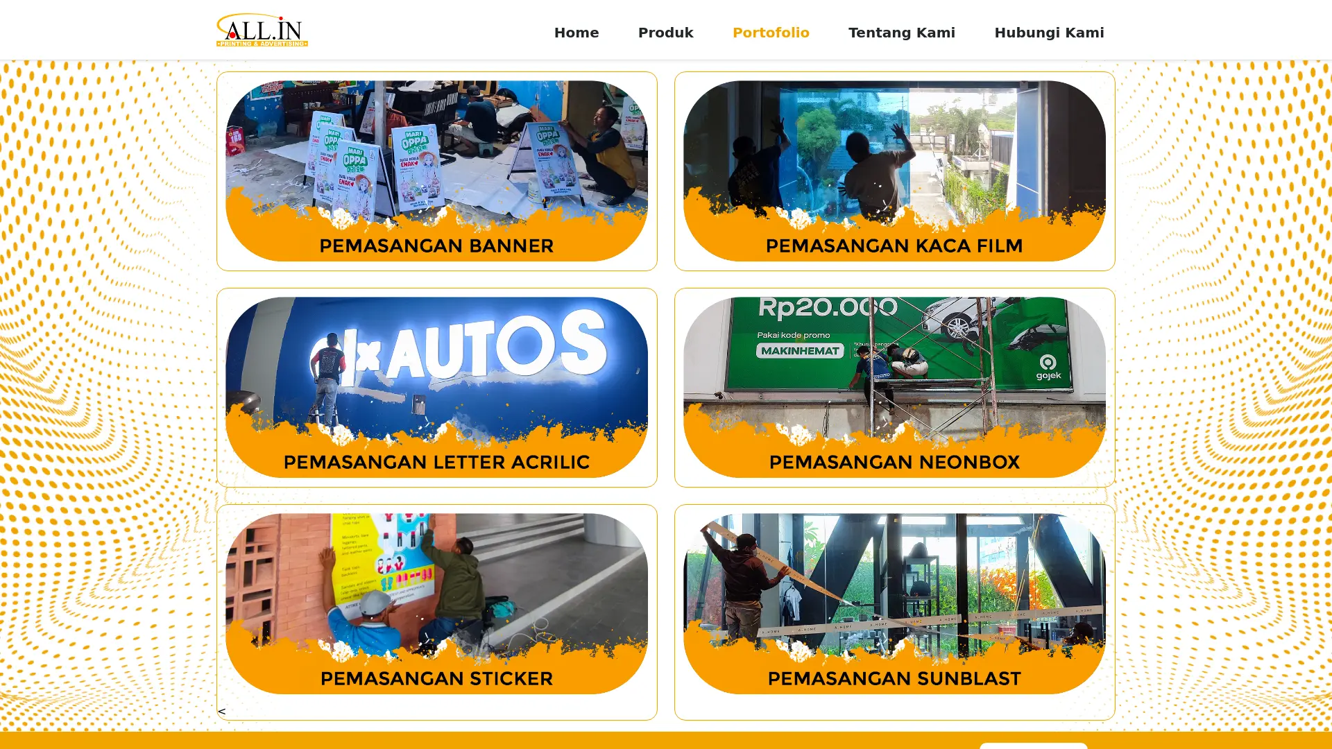
- Showcases completed projects with responsive image galleries and descriptive text.
- Designed to scale effectively for users on mobile devices or larger screens.
-
Contact Page:
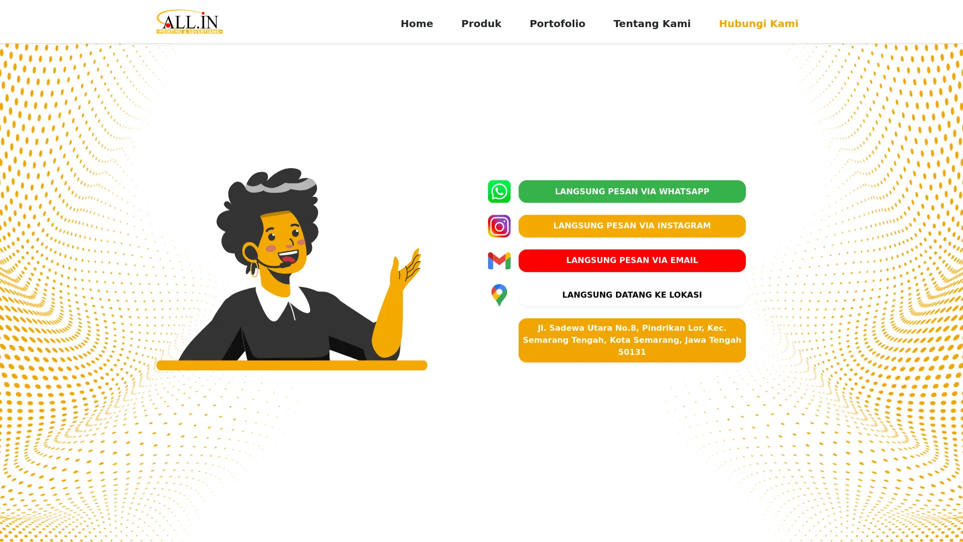
- Includes an intuitive contact form, clickable phone/email links, and a responsive map.
- Optimized for easy navigation on smaller screens.
-
About Page:
- Features the company’s mission, values, and team introductions.
- Designed with responsive typography and spacing for readability on all devices.
Development Process:
The website was meticulously crafted by converting a PDF design into a fully functional static HTML and CSS portfolio. Bootstrap 5’s grid system and utility classes were leveraged to create a responsive design that adapts to different screen sizes and orientations. JavaScript was employed for interactive elements, further enhancing usability and user engagement.
Purpose:
This project demonstrates the developer’s ability to translate static designs into a responsive, mobile-friendly website. It showcases expertise in creating visually appealing and functional websites tailored to SMEs in the e-commerce, printing, and advertising industries.


